Contents
AP Statistics: Lecture Notes
These are the notes of my AP Statistics lectures, organised by the units of the official AP course. The examples are the ones we worked through on the board.
| Unit | Topic | Status |
|---|---|---|
| 1 | Exploring One-Variable Data | in progress |
| 2 | Exploring Two-Variable Data | covered |
| 3 | Collecting Data | covered |
| 4–9 | Probability, sampling distributions and inference | coming later |
Unit 1: Exploring One-Variable Data
The Big Picture
The course has three big parts:
- Exploratory data analysis (Units 1–2): looking at data, drawing it and summarising it with numbers.
- Probability (Units 4–5): the mathematics of chance, which tells us how much samples vary.
- Inference (Units 6–9): using a sample to draw conclusions about a whole population.
In the same way, statistics itself splits into two kinds:
- Descriptive statistics describes the data we actually have.
- Inferential statistics uses the data we have (a sample) to say something about data we do not have (the population).
Population, Sample, Parameter, Statistic
- The population is the whole group we are interested in. A number that describes the population is a parameter.
- A sample is the part of the population we actually observe. A number calculated from the sample is a statistic.
An easy way to remember: population goes with parameter, sample goes with statistic. We usually do not know the parameter; we estimate it with a statistic.
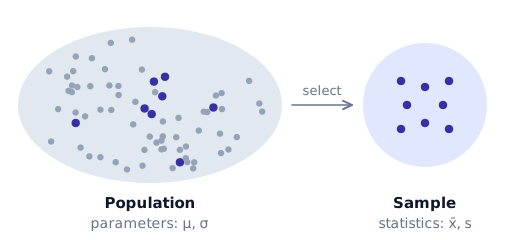
Notation follows the same split: statistics get Latin letters, parameters get Greek letters.
| Sample (statistic) | Population (parameter) | |
|---|---|---|
| mean | $\bar{x}$ | $\mu$ |
| standard deviation | $s_x$ | $\sigma$ |
| proportion | $\hat{p}$ | $p$ |
Types of Variables
- A categorical variable puts each individual into a group: eye colour, favourite subject, city of birth. Even if the categories are written with numbers (a postcode, a jersey number), they are categorical if adding or averaging them makes no sense.
- A quantitative variable is a number that we can do arithmetic with: height, exam score, number of siblings.
Quantitative variables are of two kinds:
- Discrete: the possible values can be listed, usually counts. The number of heads in 20 coin flips can only be $0, 1, 2, \dots, 20$.
- Continuous: any value in an interval is possible, usually measurements. A height can be $172$, $172.4$, $172.43$ cm, …
Describing a Distribution
When you are asked to describe a distribution of quantitative data, always comment on four things, in context (name the variable and the units):
- Shape: symmetric or skewed, how many peaks, any gaps or clusters.
- Center: a typical value (mean or median).
- Spread: how much the values vary.
- Unusual features: outliers, gaps, clusters.
The common shapes:
- Mound-shaped (bell-shaped): one peak in the middle, falling off on both sides.
- Roughly symmetric: the left half is close to a mirror image of the right half.
- Skewed left (negatively skewed): the long tail is on the left, most values are high.
- Skewed right (positively skewed): the long tail is on the right, most values are low.
- Bimodal: two clear peaks; often a sign that two different groups are mixed together.
- Uniform: all bars roughly the same height, no peak.
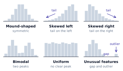
The direction of skew is the direction of the tail, not of the peak.
Dotplots
Draw a number line and put one dot above it for every value; repeated values are stacked on top of each other. Dotplots are quick and show every single value, so they are best for small datasets.
Stemplots (Stem-and-Leaf Plots)
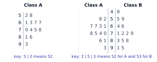
Every value is split into a stem (the leading digits) and a leaf (the last digit). The stems are written once in a column, and the leaves are written next to their stem, in order.
Always give a key. Without it, nobody knows what the numbers mean:
| Key | Means |
|---|---|
| $3 \mid 5$ | $35$ |
| $28 \mid 1$ | $28.1$ |
| $2 \mid 1$ | $0.0021$ (if the key says so) |
- Split stems: when there are too few stems, each stem is used twice: once for leaves $0$–$4$ and once for leaves $5$–$9$. This stretches the plot so the shape becomes visible.
- Back-to-back stemplot: two datasets share one column of stems; one set of leaves goes to the left, the other to the right. It is a quick way to compare two groups. One key works for both sides (for example $1 \mid 5$ means $15$).
A stemplot is a histogram turned on its side that still keeps the actual values.
Bar Charts (Categorical Data)
The categories go on the horizontal axis; the height of each bar is the frequency (count) or the relative frequency (proportion).
Example. 25 students choose their favourite subject, and 5 of them choose mathematics. The frequency of "mathematics" is $5$ and the relative frequency is
$$ \frac{5}{25} = 0.20 = 20\% . $$
Bars in a bar chart are drawn with gaps between them, because the categories are separate and their order usually does not matter.
Histograms (Quantitative Data)
Split the number line into intervals of equal width (bins or classes) and draw a bar over each one whose height is the number (or proportion) of values that fall in it. A value on the boundary belongs to exactly one bin, so bins are written like $20 \le x < 30$. There are no gaps between the bars, because the number line is continuous.
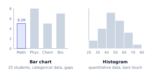
- The bin width changes the picture: with width 10 you see the rough shape, with width 5 you see more detail (and more noise).
- A histogram loses the individual values: you only know how many values fall in each bin.
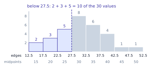
Example (class boundaries). A histogram has bars centred at $15, 20, 25, \dots, 50$. Consecutive midpoints are $5$ apart, so every bar is $5$ wide and the bars reach $2.5$ on either side of their midpoint. The boundaries are
$$ 12.5,\ 17.5,\ 22.5,\ \dots,\ 52.5 . $$
If the first three bars hold $2, 3$ and $5$ of the $30$ values, the proportion of values below $27.5$ is
$$ \frac{2 + 3 + 5}{30} = \frac{10}{30} \approx 0.33 . $$
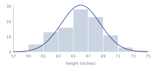
Example (normal-looking data). The heights of 100 adult women, drawn with bins such as $59 \le x < 61$, give a roughly symmetric, mound-shaped histogram centred near 66 inches. Data like this is called approximately normal; the normal curve comes later in this unit.
Measures of Center
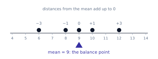
The mean (average, ortalama) adds all the values and divides by how many there are:
$$ \bar{x} = \frac{\sum x_i}{n} = \frac{x_1 + x_2 + \dots + x_n}{n} . $$
Example. Quiz scores $6, 8, 9, 10, 12$: $\bar{x} = \dfrac{45}{5} = 9$.
The median is the middle value of the sorted data: at least half of the values are at or below it and at least half are at or above it.
- Sort the data first.
- With $n$ values, the median sits at position $\dfrac{n+1}{2}$.
- If that position is a whole number, the median is that value; if it ends in $.5$, the median is the mean of the two values on either side.
Example. For $10, 20, 30, 40$ we have $n = 4$, so the position is $\dfrac{4+1}{2} = 2.5$: halfway between the 2nd and 3rd values, and the median is $\dfrac{20 + 30}{2} = 25$.
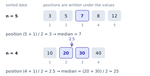
$\dfrac{n+1}{2}$ is the position (index) of the median, not the median itself.
Resistance
A statistic is resistant if a few extreme values cannot change it much.
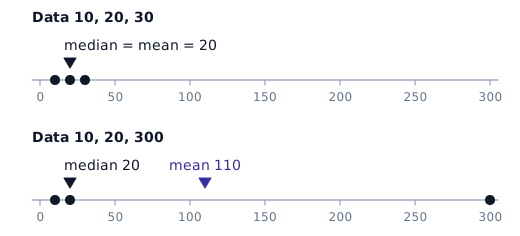
Example. For $10, 20, 30$ the median is $20$ and the mean is $20$. Change the last value to $300$:
$$ 10,\ 20,\ 300 \qquad \Rightarrow \qquad \text{median} = 20,\quad \bar{x} = \frac{330}{3} = 110 . $$
The median did not move at all; the mean jumped from 20 to 110. The median is resistant, the mean is not.
This tells us which one to use:
- Symmetric data: mean and median are close; either works.
- Skewed data or data with outliers: the median describes the center better.
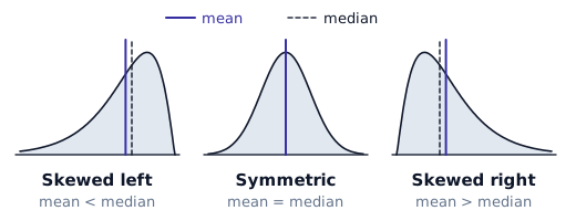
Mean versus median in a skewed distribution. Look at the tail: the mean is pulled toward the tail.
- Skewed right: mean $>$ median.
- Skewed left: mean $<$ median.
Estimating the Median from Grouped Data
If you only have a frequency table or a histogram, you cannot find the median exactly, but you can find which interval it is in. Add a cumulative frequency column (the running total).
Example. The quiz scores of 60 students:
| Score | Frequency | Cumulative frequency |
|---|---|---|
| $0 \le x < 10$ | 4 | 4 |
| $10 \le x < 20$ | 9 | 13 |
| $20 \le x < 30$ | 15 | 28 |
| $30 \le x < 40$ | 18 | 46 |
| $40 \le x < 50$ | 14 | 60 |
The median is at position $\dfrac{60+1}{2} = 30.5$, between the 30th and 31st values. The cumulative frequency is 28 up to 30, and reaches 46 at 40, so the 30th and 31st values are both in $30 \le x < 40$. The median is somewhere in that interval.
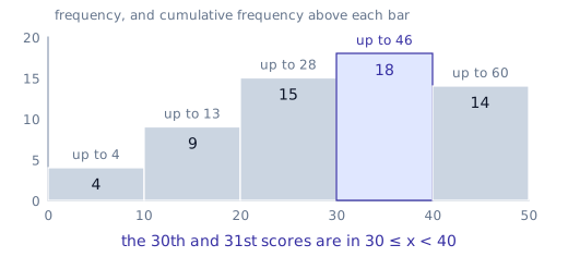
The same idea locates the quartiles. The first quartile is the median of the lower 30 values, at position $15.5$; the cumulative frequency passes 15 in the third row, so $Q_1$ is in $20 \le x < 30$.
Unit 2: Exploring Two-Variable Data
Scatterplots
In Unit 1 we looked at one variable at a time. Now every individual gives us two quantitative values, a pair $(x, y)$, and we want to know how they are related. The graph for this is a scatterplot: one point per individual.
- The explanatory variable $x$ (the one we think explains or predicts) goes on the horizontal axis.
- The response variable $y$ (the one we measure as the outcome) goes on the vertical axis.
On the calculator, enter the $x$-values in L1 and the $y$-values in L2.
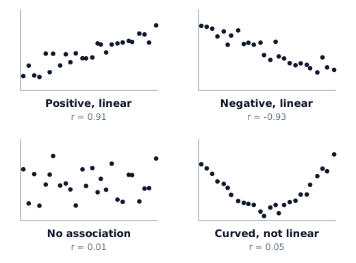
Describe a scatterplot with direction, form and strength (plus unusual points), in context:
- Positive association: above-average $x$ goes with above-average $y$; the cloud rises from left to right.
- Negative association: above-average $x$ goes with below-average $y$; the cloud falls from left to right.
- Form: linear, or curved (for example U-shaped).
- Strength: how tightly the points follow the form.
On the exam a quick hand sketch of the scatterplot is enough, but the axes must be labelled and scaled.
The Correlation Coefficient $r$
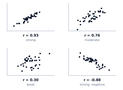
The correlation $r$ measures the direction and the strength of a linear relationship:
$$ r = \frac{1}{n-1} \sum \left( \frac{x_i - \bar{x}}{s_x} \right) \left( \frac{y_i - \bar{y}}{s_y} \right) = \frac{1}{n-1} \sum z_{x_i}\, z_{y_i} . $$
So $r$ is (almost) the average of the products of the $z$-scores. When a point is above average in both $x$ and $y$, or below average in both, the product is positive; this is why positive association gives a positive $r$. You will not compute it by hand; the formula is on the formula sheet and the calculator gives $r$.
Properties of $r$:
- $-1 \le r \le 1$. At $r = \pm 1$ the points lie exactly on a line.
- The sign gives the direction: $r > 0$ positive, $r < 0$ negative.
- A rough guide to strength:
 -1        -0.8        -0.5         0         0.5        0.8         1
  |  strong  | moderate  |   weak   |   weak   | moderate  |  strong  |
- $r = 0$ means no linear relationship. There may still be a strong curved one: points on a U-shape can have $r$ close to 0.
- Swapping $x$ and $y$ does not change $r$.
- Changing units (hours to minutes, inches to cm) does not change $r$.
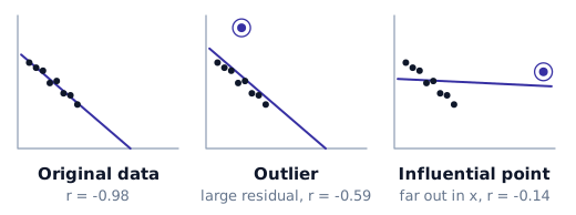
- $r$ is not resistant. One point far away from the rest can change $r$ a lot, even turn a negative association into a positive-looking one. Always look at the scatterplot, not just at $r$.
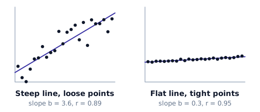
Correlation is not slope. A steep line with points widely scattered around it has a large slope but a small $r$; a nearly flat line with points tightly on it has a small slope but $r$ close to 1. $r$ measures how close the points are to a line, not how steep the line is.
Calculator. To see $r$ on a TI-84, turn on DiagnosticOn (from CATALOG) once. Then STAT → CALC → LinReg(a+bx) L1, L2 gives $a$, $b$, $r^2$ and $r$.
Correlation Does Not Imply Causation
A strong correlation between two variables does not show that one causes the other. Often a third variable (a lurking or confounding variable) drives both. Ice cream sales and drownings rise together, but hot weather causes both. Only a well-designed experiment (Unit 3) can show cause and effect.
The Least-Squares Regression Line (LSRL)
If the scatterplot looks linear, we fit a line to predict $y$ from $x$. Here, unlike for $r$, it matters which variable is $x$ and which is $y$.
$$ \hat{y} = a + bx $$
- $\hat{y}$ ("y-hat") is the predicted value of $y$.
- $b$ is the slope, $a$ is the $y$-intercept (the predicted $y$ when $x = 0$).
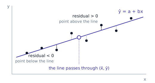
For every point, the vertical distance from the point to the line is its residual:
$$ \text{residual} = y - \hat{y} = \text{actual} - \text{predicted} . $$
For the regression line the residuals always add up to zero, $\sum (y - \hat{y}) = 0$, so their sum cannot tell us which line is best. Instead we square them: the least-squares regression line (the "line of best fit") is the line that makes the sum of squared residuals $\sum (y - \hat{y})^2$ as small as possible.
Formulas.
$$ b = r \, \frac{s_y}{s_x}, \qquad a = \bar{y} - b\,\bar{x} . $$
The second formula says that the LSRL always passes through the point $(\bar{x}, \bar{y})$. The first says that the slope and $r$ always have the same sign.
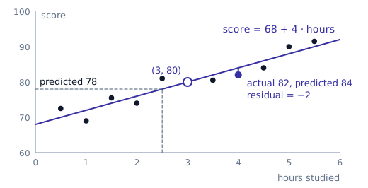
Example. For hours studied ($x$) and test score ($y$): $\bar{x} = 3$, $\bar{y} = 80$, $s_x = 2$, $s_y = 10$, $r = 0.8$. Then
$$ b = 0.8 \cdot \frac{10}{2} = 4, \qquad a = 80 - 4 \cdot 3 = 68, \qquad \widehat{\text{score}} = 68 + 4\,(\text{hours}) . $$
- Slope in context: for each additional hour of study, the predicted score increases by 4 points.
- Intercept in context: a student who does not study at all is predicted to score 68.
- Prediction: a student who studies 2.5 hours is predicted to score $68 + 4(2.5) = 78$. This is a prediction, not a guarantee.
Always define the variables in context. "$\hat{y} = 68 + 4x$" with no explanation of $x$ and $y$ does not get full credit.
Reading computer output. Regression software prints a table like this:
Predictor      Coef    SE Coef      T       P
Constant     68.000      ...       ...     ...
Hours         4.000      ...       ...     ...

S = ...      R-Sq = 64.0%
The number next to Constant is the intercept $a$, the number next to the variable name is the slope $b$, and R-Sq is $r^2$. The other columns belong to inference (Unit 9).
On a TI-84: STAT → CALC → LinReg(a+bx) L1, L2, Y1. The explanatory variable must come first. Adding Y1 stores the line, so Y1(2.5) gives the prediction directly.
Residuals and Residual Plots
- A positive residual means the point is above the line: the actual value is higher than predicted (the line underestimated).
- A negative residual means the point is below the line: the line overestimated.
Example. With $\widehat{\text{score}} = 68 + 4(\text{hours})$, a student who studied 4 hours and scored 82 has predicted score $68 + 16 = 84$ and residual $82 - 84 = -2$. The line overestimated this student by 2 points.
A residual plot puts the residuals on the vertical axis against $x$ (or against the predicted values $\hat{y}$). It is the main tool for checking whether a line is a good model. A line is appropriate when the residuals are
- randomly scattered with no pattern, and
- spread around 0.
Patterns that warn you:
- a curve (U-shape or upside-down U): the relationship is not linear;
- a fan that opens out: the predictions get less reliable as $x$ grows;
- residuals all positive at both ends and negative in the middle (or the reverse): again, a curve.
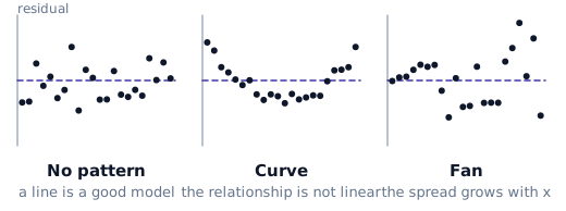
Example. Population growth is usually not linear but exponential. A line fitted to it misses at both ends, and the residual plot shows a clear U-shape.
On the calculator, every LinReg stores its residuals in the list RESID (in 2nd LIST), which you can use as the $y$-list of a scatterplot.
Interpolation and Extrapolation
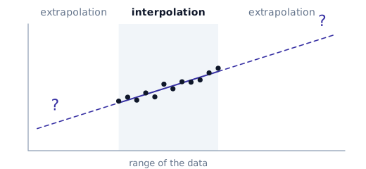
- Interpolation: predicting for an $x$-value inside the range of the data. Fairly safe if the line fits well.
- Extrapolation: predicting for an $x$-value outside that range. Dangerous: nothing guarantees the linear pattern continues. A line that predicts children's height from age between 18 and 29 months will give absurd heights if you plug in an age of 12 years.
The Coefficient of Determination $r^2$
Without any $x$ information, the best prediction for $y$ is simply $\bar{y}$. Compare the total error of the two ways of predicting:
$$ \text{SST} = \sum (y - \bar{y})^2 \quad \text{(error using the mean)}, \qquad \text{SSE} = \sum (y - \hat{y})^2 \quad \text{(error using the line)} . $$
$$ r^2 = \frac{\text{SST} - \text{SSE}}{\text{SST}} $$
is the proportion of the variation in $y$ that is explained by the linear relationship with $x$. It is exactly the square of the correlation $r$.
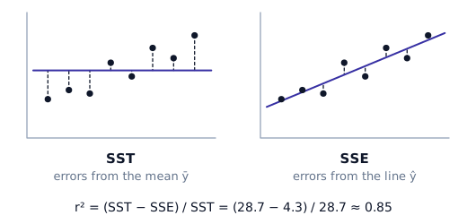
Interpretation sentence (learn it): "$r^2 = 0.64$ means that 64% of the variation in test score is explained by the linear relationship with hours studied."
Going back from $r^2$ to $r$: $r = \pm\sqrt{r^2}$, and the sign is the sign of the slope. If $r^2 = 0.64$ and the slope is positive, $r = 0.8$; if the slope is negative, $r = -0.8$.
Outliers and Influential Points
- An outlier in regression is a point with a large residual: far from the line, outside the overall pattern.
- An influential point is one that changes the regression a lot (slope, intercept, $r$) when you remove it. Points that are far out in the $x$-direction (high leverage) are often influential: they pull the line toward themselves, so they may even have a small residual.
To decide, imagine removing the point: if the line or $r$ changes a lot, the point is influential.
Transformations to Achieve Linearity
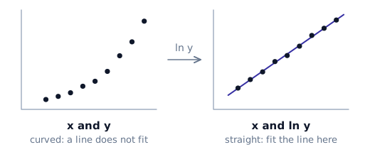
If the scatterplot or the residual plot shows a curve, a line is not a suitable model for the original data. Sometimes we can transform a variable so that the relationship becomes linear, fit a line to the transformed data, and then transform back.
The typical case is exponential growth (bacteria, populations, money with interest): take the natural logarithm of $y$.
- Compute $\ln y$ for every point (on the calculator:
L3 = ln(L2)). - Check that $x$ versus $\ln y$ looks linear and its residual plot shows no pattern.
- Fit the line: $\widehat{\ln y} = a + bx$ (
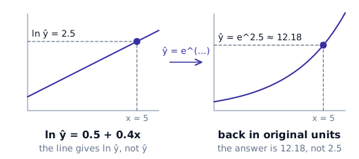
LinReg(a+bx) L1, L3). - Predict, then back-transform: the line gives $\ln \hat{y}$, so $\hat{y} = e^{\,a + bx}$.
Example. The model is $\widehat{\ln y} = 0.5 + 0.4x$. For $x = 5$: $\ln \hat{y} = 0.5 + 0.4 \cdot 5 = 2.5$, so $\hat{y} = e^{2.5} \approx 12.18$. Forgetting the last step (answering $2.5$) is the classic mistake.
On the exam you will rarely transform raw data yourself; more often you get the output for transformed data and are asked whether the transformation helped (compare the scatterplots, residual plots and $r^2$ values).
Unit 3: Collecting Data
Most of AP Statistics is about analysing data and drawing conclusions from it. This unit is about the step before that: how the data is collected. A conclusion can never be better than the data behind it, so a badly collected sample makes every later calculation meaningless, however careful it is.
Census or Sample?
The only way to know a population exactly is a census: you check every unit in the population. In practice a census is usually
- impractical (you cannot reach everybody),
- too slow, and
- too expensive.
So we take a sample, a part of the population, and use it to say something about the whole. The aim is a representative sample: one that looks like the population in the features we care about. A well-chosen sample of a few thousand people can describe a whole country surprisingly well; a badly chosen sample of a million can be useless.
Population, Sampling Frame and Sample
Three different sets are involved, nested inside each other:
- the population: everyone we want to know about,
- the sampling frame: the list we actually choose from,
- the sample: the units we end up selecting from the frame.
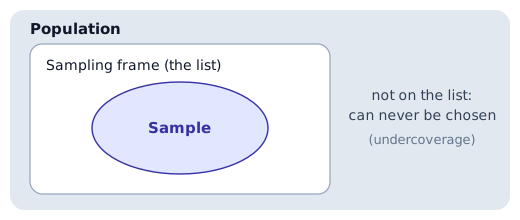
Ideally the frame is the population, but often it is not. If you want to study all students of a school but choose from the list of students who have an e-mail address, everyone without one is in the population but not in the frame, and can never be selected.
Bias is not the same as "nonrepresentative". Bias is a property of the method: a biased method gives estimates that are too high (or too low) on average, over many samples. Nonrepresentative describes one particular sample that happens to differ from the population. A perfectly fair random method can still, by bad luck, give a nonrepresentative sample; it just does not do so systematically.
Probability Samples
In a probability sample every member of the population has a known chance of being chosen, and some random mechanism (drawing names, a random number generator, dice) does the choosing. The chances do not have to be equal, but they have to be known. Using chance instead of human judgement is what protects us from bias.
Random Sample and Simple Random Sample (SRS)
- Random sample: every individual has the same chance of being selected.
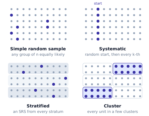
- Simple random sample (SRS) of size $n$: every possible group of $n$ individuals has the same chance of being the sample.
An SRS is always a random sample, but a random sample is not always an SRS.
Example (drawing names). A school has 3000 seniors and we want 30 of them. Write every name on a slip, mix the slips well and draw 30. Every set of 30 seniors could come out, all with the same chance, so this is an SRS.
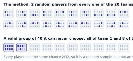
Example (two from each team). A league has 20 teams with 32 players each, 640 players in total. We want 40 players, so we pick 2 players at random from every team.
- Each player has the same chance, $2/32$, of being chosen, so this is a random sample.
- But a sample made of all 32 players of team 1 and 8 players of team 2 can never come out of this method, even though it is a perfectly valid group of 40 players. Not every group of 40 is possible, so this is not an SRS.
Example (counting the possible samples). A population has 12 people, $p_1, p_2, \dots, p_{12}$, and we want a sample of 4. The number of different samples of size 4 is
$$ \binom{12}{4} = \frac{12!}{4!\,8!} = 495 . $$
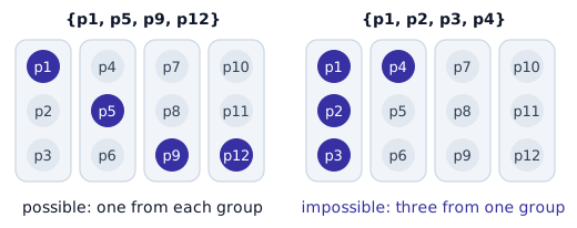
An SRS must make all 495 of them equally likely. Now try this method instead: split the people into four groups $\{p_1,p_2,p_3\}$, $\{p_4,p_5,p_6\}$, $\{p_7,p_8,p_9\}$, $\{p_{10},p_{11},p_{12}\}$ and pick one person at random from each group. A sample such as $\{p_1, p_5, p_9, p_{12}\}$ is possible, but $\{p_1, p_2, p_3, p_4\}$ can never be reached, because it takes three people from the same group. So the method is random but not an SRS.
Systematic Sample
Choose the first unit at random, then take every $k$-th unit after it. For a population of size $N$:
$$ k = \frac{N}{n} \quad \text{(sample of size } n\text{)}, \qquad k = \frac{100}{p} \quad \text{(sample of } p\% \text{ of the population)} . $$
Pick the starting point at random from the first $k$ units, then keep adding $k$.
Example. From 100 students we want 10, so $k = 10$. Pick a random starting point between 1 and 10, say 3, and then take
$$ 3,\ 13,\ 23,\ 33,\ \dots,\ 93 . $$
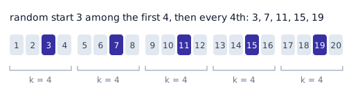
Example. From 20 people we want 5, so $k = 4$. Pick a random start between 1 and 4, say 3: the sample is $3, 7, 11, 15, 19$.
Example (exam style). Describe a systematic method to select 30 students from a population of 3000. Number the students from 1 to 3000. Since $3000 / 30 = 100$, choose a random number between 1 and 100, say 23, and then take every 100th student: $23, 123, 223, \dots, 2923$.
Example (a percentage). We want 10% of the seniors on an alphabetical list. Then $k = 100/10 = 10$: choose one of the first 10 names at random and take every 10th name after it.
Before the starting point is chosen every person has the same chance ($1/k$) of being selected, so a systematic sample is a random sample. It is not an SRS: neighbours on the list can never be in the sample together. With 100 students and $k = 10$, the sample $\{3, 4, 5, \dots, 12\}$ is a perfectly good group of 10, but this method can never produce it.
Stratified Random Sample
- Divide the population into groups called strata (singular: stratum). Units within a stratum are similar to each other.
- Take a separate SRS from every stratum.
- Combine them into one sample.
Notes:
- The strata may have different sizes.
- We may take different numbers of units from different strata. A common choice is to take them in proportion to the strata, so the sample mirrors the population.
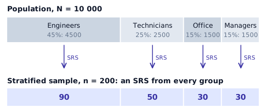
Example. A company's staff is 45% engineers, 25% technicians, 15% office staff and 15% managers. A proportional stratified sample of 200 people takes an SRS of
$$ 0.45 \cdot 200 = 90,\quad 0.25 \cdot 200 = 50,\quad 0.15 \cdot 200 = 30,\quad 0.15 \cdot 200 = 30 $$
from the four groups, $90 + 50 + 30 + 30 = 200$ in total. If the company has $N = 10\,000$ employees, the strata contain $4500$, $2500$, $1500$ and $1500$ people, and we take an SRS of 90 out of the 4500 engineers, 50 out of the 2500 technicians, and so on.
Stratifying guarantees that every group is represented, and it usually gives more precise estimates than an SRS of the same size.
Cluster Sample
- Divide the population into groups called clusters. Ideally each cluster is a small copy of the population, a mixture of all kinds of units.
- Choose some clusters at random.
- Take every unit in the chosen clusters.
Example. 40 people stand in a line and are split into clusters of 5: $\{1,\dots,5\}$, $\{6,\dots,10\}$, … Choose two clusters at random, say the 1st and the 5th, and survey everyone in them: $1,2,3,4,5$ and $21,22,23,24,25$.

Cluster sampling is popular because it is cheap: choosing a few schools and surveying every teacher in them is far easier than visiting teachers scattered across a whole city.
Stratified or Cluster? Don't Mix Them Up
| Stratified | Cluster | |
|---|---|---|
| Groups are… | similar inside, different from each other | mixed inside, similar to each other |
| From each group we… | take an SRS from every group | take all units of some groups |
| Main reason | precision, every group represented | convenience, lower cost |
Nonprobability Samples
Sometimes samples are collected without any random mechanism, and the collector simply hopes the result is representative. The danger is an unknown bias that we cannot measure. Common examples:
- Voluntary response (self-selected) sample. People decide themselves whether to take part: online polls, call-in shows, "send us your opinion" forms. Those with strong (usually negative) feelings answer the most.
- Convenience sample. The collector takes whoever is easiest to reach: the students in one classroom, the first people walking through a door. The collector, not chance, decides who is in the sample.
- Quota sample. The collector fills quotas so that the sample matches known features of the population (for example, 50% women), but chooses the individuals personally. It looks like a stratified sample, but the selection inside each group is not random.
Sampling Bias
Our goal is to avoid bias: a method that, on average, gives answers that are too high or too low. The main types:
- Undercoverage. Part of the population can never be chosen because it is missing from the sampling frame. A survey done only online misses everyone without internet access.
- Voluntary response bias. Comes from self-selected samples: the people who choose to answer are not typical.
- Nonresponse bias. People are selected but do not answer. If those who stay silent differ from those who reply, the results are biased, even though the original selection was random.
- Wording bias. The way a question is phrased pushes the answers. "Should students be forced to wear uniforms?" and "Should schools adopt a uniform to reduce peer pressure about clothes?" ask about the same policy but will get very different results. Mentioning the cost ("billions of dollars") or using loaded words ("forced") moves the answers in a predictable direction.
- Response bias. People do not answer truthfully or accurately: they want to please the interviewer, they are embarrassed by the true answer, they misunderstand the question, or the order of the options influences them.
Example. A school counsellor asks the next 25 students who come for counselling how satisfied they are with the counselling service. Several problems at once:
- it is a convenience sample, not a random one;
- only students who already use the service are asked, so the rest of the school is missing (undercoverage), and they are likely to have a more favourable view;
- the counsellor asks in person, so students tend to please the interviewer (response bias).
A large sample does not fix bias. A biased method with a huge sample just gives the wrong answer very precisely.
Observational Studies and Experiments
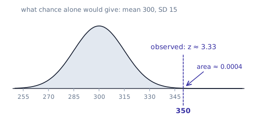
Statistical significance. A difference between groups is statistically significant if it is too large to be explained by chance alone. The idea is the same as asking how unusual a value is with a $z$-score. If a group's average is normally distributed with mean 300 and standard deviation 15 when the treatment does nothing, an observed average of 350 has
$$ z = \frac{350 - 300}{15} \approx 3.33, \qquad P(\bar{x} \ge 350) = \texttt{normalcdf}(350,\ 10^{99},\ 300,\ 15) \approx 0.0004 . $$
That would happen by chance in about 4 out of 10 000 repetitions, so we do not believe it is just chance: the result is significant. The exact methods come later in the course, with inference.
- In an observational study we only observe and record; we do not change anything. Surveys are observational studies.
- Retrospective: looks back at data that already exists.
- Prospective: chooses subjects now and follows them into the future.
- In an experiment we impose a treatment on the experimental units (called subjects when they are people) and measure the effect.
- The explanatory variable (factor) is what we change; the response variable is what we measure.
Only a well-designed experiment can show cause and effect. An observational study can show an association, but not that one thing causes another.
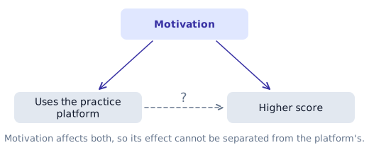
Confounding. Two variables are confounded when their effects on the response cannot be separated. Students who use an online practice platform may score higher, but they may also simply be more motivated, and motivation alone could explain the higher scores. Motivation is a confounding variable.
The Three Principles of Experimental Design
- Control. Keep everything except the treatment as equal as possible between the groups, and compare with a control group: no treatment, an existing treatment, or a placebo.
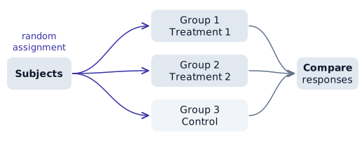
- Randomization. Use chance to assign subjects to treatments. This balances the variables we did not think of (or cannot measure) between the groups, so a difference in the response can be blamed on the treatment.
- Replication. Use enough subjects in each group, so that natural variation between individuals does not hide (or fake) a real effect.
How to Randomize
Any of these is fine, as long as you describe it clearly:
- Slips of paper: write each name (or number) on identical slips, mix them in a container and draw.
- Random number generator: number the subjects $1$ to $N$ and use, for example,
randInt(1, N)on the calculator; ignore repeats. - Table of random digits: give each subject a label with the same number of digits ($01, 02, \dots, 60$), read the table in groups of that many digits, and skip numbers that are out of range or already used.
Completely Randomized Design
Every subject is assigned to a treatment group completely at random; then the groups are compared.
Placebo and blinding. A placebo is a fake treatment (a sugar pill, for example). It is used because people often improve just because they believe they are being treated: the placebo effect. A placebo is not needed when a new treatment is compared with an existing one whose effect is already known.
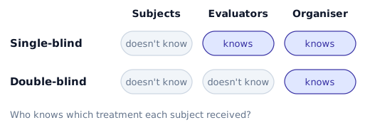
- Single-blind: the subjects do not know which treatment they get.
- Double-blind: neither the subjects nor the people who measure the response know who got which treatment. Someone (the person who prepared the assignment) still knows.
Randomized Block Design
If we already know a variable that affects the response (for example, gender or prior grades), we block on it:
- Split the subjects into blocks that are similar with respect to that variable.
- Carry out a completely randomized experiment separately inside each block.
- Compare the treatments within each block.
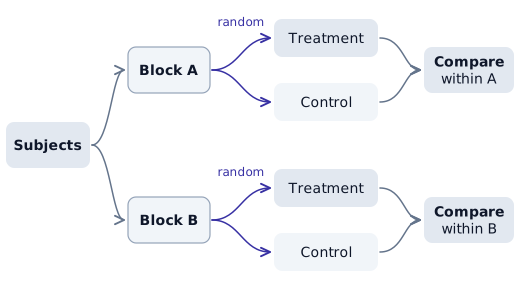
Block what you know, randomize what you don't. Blocking removes the effect of the variables we know about; randomization takes care of the rest.
Matched-Pairs Design
A special block design with blocks of size two:
- the same subject twice: before and after, or both treatments in a random order, or
- two very similar subjects paired up (same age, same level), with a coin deciding which of the two gets which treatment.
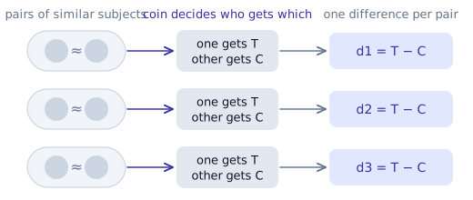
In the analysis we work with the differences within each pair, which turns the two columns of data into one.
Exam Tips
Unit 1
- Describe a distribution with shape, center, spread and unusual features, always in context.
- Give a key with every stemplot.
- Skewness points to the tail; the mean is pulled toward the tail, the median is not.
- $\dfrac{n+1}{2}$ is the position of the median, not its value, and the data must be sorted first.
Unit 2
- Describe a scatterplot with direction, form and strength, in context.
- Interpret the slope as "for each additional unit of $x$, the predicted $y$ increases (decreases) by $b$". Use the word predicted.
- Residual = actual − predicted.
- A good linear model has a residual plot with no pattern, scattered around 0.
- $r^2$: "…% of the variation in $y$ is explained by the linear relationship with $x$".
- Correlation does not imply causation.
Unit 3
- When asked whether a sample is an SRS, check whether every group of size $n$ could be chosen, not just every individual.
- When you describe a sampling or randomization procedure, say exactly how the randomness is produced (numbering the units, a random number generator, drawing slips), and whether repeated numbers are skipped.
- Know the difference between an experiment and an observational study, and why only experiments support cause-and-effect conclusions.
- In a block design, remember to randomize the treatments inside each block.